Style.com (Vogue) reviews
So the next part of the design process for my collection is to talk about the works of other designers by doing style. com reviews. Well due to the website no longer existing, I had to find other ways of reviewing collections. So I resorted to looking them up mostly on the Vogue website and make my reviews based on the collections displayed in the fashion showcases. Anyway, Here are my reviews and I will now start my next phase by making sketches and sewing up some muslins.
MARK KENLY DOMINO TAN COPENHAGEN FALL 2016

Color story working?
The color story seems to work together with both dark and very bold bright colors. I like how it worked it way through each of the colors. Bringing in the bold in the middle of dark colors on occasion. It allows the collection to break up a bit and bring some interest to the audience.
Shapes innovative or stale
The shapes are innovative. I love how it's both loose yet very constructive overall for the collection.
quality of garments
The quality is very strong and very well made with really good quality fabrics. It looks to be made to be a bold choice of business wear.
Good or bad collection
It's a really good collection overall in my opinion. I love the color and some of the patterns on the garments. I got the theme of it to take from the seventies and some from Victorian times.
As a whole, is the overall look fashion forward or backwards
It really is taking fashion forward while emulating the past. Which is what fashion is doing as of right now and has always been. To showcase the past in whole new light and make it new by bringing new elements.
Are you influenced?
Some of the elements I would like to use in my collection. There's some unique pieces in the collection that takes advantage of a looser silhouette.
Can you see anyone wearing these garments?
I can. It's modern and utilizes the loose fit to make it work for both genders to pull them off.
VIKTOR & ROLF SPRING 2017 COUTURE COLLECTION

Color story working?
Color seems to be all over the place but it still is very youthful. I would prefer it if it was kept in a more orderly fashion when it comes out on the runway instead.
Shapes innovative or stale
Shape is definitely played in this collection as it utilizes pieces from old garments into their collection pieces. Some of the styles of classic like the ballgowns, but other pieces are really uniquely shaped.
quality of garments
They look to be more on the costume side since they look to be more out there pieces than really something to be wearable. I would say it's not meant to be worn more than just one time as it is so bold and something that really needs to have the occasion for it.
Good or bad collection
It's good. I love the color and the ideas that are being used for the pieces. It's just a bit all over the place with the details.
As a whole, is the overall look fashion forward or backwards
It has the potential to go forward with the idea of reusing pieces from previous garments but I think it could be more done in a more wearable way. But it is a couture collection so I would let it slide.
Are you influenced?
I love the overall concept behind this but I would prefer to not do it in that way for my collection since I want my collection to be a bit more comfortable to wear than really to go all out.
Can you see anyone wearing these garments?
I would see someone who really loves color and has the confidence to pull these type of garments off. It's definitely not meant for the everyday person.
NICHOLAS NYBRO COPENHAGEN FALL 2016

Color story working?
The color story is consistent and simple. It's black, white, and red. That's it. And it's kept that way throughout the collection in a bold way by keeping it one color in each model. Which is not too unique but really cool to kinda of look at.
Shapes innovative or stale
The shape is played in this collection. Very good use of draping and fit for the garments.
quality of garments
It really look to be very well made and comfortable for a lot of consumers. Most pieces uses some kind of cotton blends for comfort. Plus the draping and designs make it very unique.
Good or bad collection
I really like it. It's very bold but also chill. It definitely has a nineties grunge feel and I like it. Then again I do like some of styles of the nineties overall.
As a whole, is the overall look fashion forward or backwards
Forward but reminiscing of the nineties with the use of the dark bold colors.
Are you influenced?
This is something I want to go for in my collection. Comfort but also something that is unique and modern for the today's consumer. I really do want to achieve some level of drapery on my garments in my upcoming collection.
Can you see anyone wearing these garments?
I can see teens and young adults wearing this type of garments. Or just people that like to have an edge to their wardrobe. It can become something for a broader age ranges with an adjustment in terms of colors. Depending on what colors do people want to have in their closet.
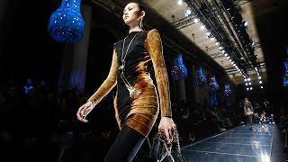
SAINT LAURENT READY-TO-WEAR FALL 2016

Color story working?
The whole color story work is both nineties and also very reminiscent of the eighties. Which seems to be the overall theme of the show. Which makes it work on some level. It used mostly black and bold bright colors like neon pink and gold. Again. Very much like the eighties.
Shapes innovative or stale
Definitely innovative where the shape of the sleeves was at play in order to make the person be drawn into the rising shape of the sleeve. Also did some draping a the waistline.
quality of garments
It has really good fabrics and some of the pieces utilizes fur in as either coat or a shirt. As well as making really beautiful black leather jackets. The outfits themselves are made very well and the fit is nothing less than what you expect from Saint Laurent.
Good or bad collection
I'm not an overall fan of the collection’s direction. Mostly because I'm not really into the eighties part of it with the use of the big belts and exaggerated shoulders. I would have preferred to see more of the Saint Laurent classic suits.
As a whole, is the overall look fashion forward or backwards
I felt it was a little too backwards in my own personal opinion. I think we are still not ready to be seeing the eighties come back again as they are seen to be over done with the embellishment and patterns. Plus it was somewhat seen more as something for the early 2000s as well and I think we need more time before seeing it making a comedy again.
Are you influenced?
I love the leather jackets and one of the patterns on an outfit that was very colorful. But not something I would really use for my collection. I personally would more like to see more seventies since that's my overall direction.
Can you see anyone wearing these garments?
It's definitely meant for someone who loves the eighties and likes to be bold overall. I wouldn't really like to wear one of these outfits personally but I can see it on someone who likes to embellish.
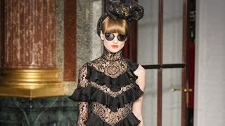
VIVIENNE WESTWOOD READY-TO-WEAR FALL 2017

Color story working?
The collection has a variety of colors and patterns. Some plaid. Some solid. Sometimes even a mixed of them throughout the collection. What I noticed is that the colors that aren't there are pink. Which is a very feminine color.
Shapes innovative or stale
I like the shape. Some of them are oversized in a fashion way and does play with shape near the end of the collection. Which is great for those who don't like tight fitting clothes. The closing of the jackets are unique. It's not too innovative but it's still a well rounded collection.
quality of garments
I like the quality. It's good, but not like the level of very expensive custom made suits or couture dresses. But they are still good for a ready to wear collection and the pieces are definitely meant to be wearable.
Good or bad collection
It's a great collection. I love the variety but it still keeps with the theme of being edgy and modern. As well as being masculine for both genders which opens a door for women that aren't looking to have pieces that are specifically feminine. As well as also giving men options to wear something that isn't specifically masculine. It provides that rare niche for gender neutrality.
As a whole, is the overall look fashion forward or backwards
These are garments I actually have been seeing on people and in movies. I think it's definitely moving fashion forward. Especially for people that don't want to wear things that gender type.
Are you influenced?
I love some of the coats. Especially the oversized trench coats. I think I want to maybe create one using a print.
Can you see anyone wearing these garments?
I can see people wearing each of the pieces. Maybe not wearing them outfits. But the individual pieces are wearable and also unique for the consumers to wear since they are not meant to be pointing to a specific market.
BETSEY JOHNSON READY-TO-WEAR SPRING 2016

Color story working?
The color story is bright and bold. Everything that just about made Betsey Johnson famous for. Her colors and prints reminds me of aspects from the seventies and eighties. Once again very much like her. I would say it didn't stray out of the both in terms of her personal style.
Shapes innovative or stale
The shapes were mostly what I have seen from her in the past. But some items were actually new and uniquely made for the show. It still has the fitted over the top look that made this collection that is her.
quality of garments
Some pieces look to be very good in quality. While others seem a bit too much like a costume than rather something that is ready to wear style.
Good or bad collection
It's an okay collection. Nothing from her collection really stand out to me mostly because her collection looks pretty much what one would expect from her as a designer. The fit and the color story looks generally the same. She really hasn't tried anything new. It's boring because I have seen this type of collection from her manny times.
As a whole, is the overall look fashion forward or backwards
It's bold and will always have a market to everyone but I feel it's a bit backwards because she hasn't really made any changes to it or tried stepping out of her comfort zone. After a while, it can make a style become dated with the designer. At least in my opinion.
Are you influenced?
I like the colors and the prints. I know that I want to use prints in my designs to make them stand out. As for the silhouettes themselves, I want to do something looser in order to make people feel more comfortable in what I made.
Can you see anyone wearing these garments?
Yeah. I can. Especially teens and young adults. Which is Betsey Johnson’s main market anyway.
MARC JACOBS SPRING READY-TO-WEAR 2017

Color story working?
The use of different colors and prints is amazingly done throughout this collection. It takes me back to everything that has inspired me to want to do the seventies in the present time.
Shapes innovative or stale
The shapes are more conventional since it's ready to wear than full on Couture. However with the use of prints, details, and design techniques has made them unique. Which in turn has made the shapes innovative with working with the prints.
quality of garments
They look amazing. Just really well down and something that is worth the money to pay for.
Good or bad collection
It's a great collection. I think it was one of Marc Jacobs bests. Even with the controversy of him using dreadlocks on white models. Which in my opinion was ridiculous since he used a diverse cast of models in his collection. The pieces were unique and memorable. They can work as an outfit or stand on their own individually.
As a whole, is the overall look fashion forward or backwards
I say it's forwards since this hasn't been seen for sometime from him for some time. He knows how to take a trend and take it all the way. It worked during the grunge era of the nineties and it will work in 2017.
Are you influenced?
That's not even a question. This collection is inspirational for what I want to achieve in my collection. The prints are great and the pieces are great once it all comes together.
Can you see anyone wearing these garments?
Yes. I can see a lot of people wearing these pieces on the street. It's very bold and colorful. Really meant for people who wish to stand out than really blend in the crowd.
AKIRA AUSTRALIA RESORT WEAR 2017

Color story working?
The color story is simple. Most of the outfits were a dark blue, black, and white. With exceptions of color and print on occasional pieces. Which allows them to stand out and draw attention.
Shapes innovative or stale
The shapes were innovative. It was loose silhouettes on many of the pieces except for some crop tops. Even then the designs were very reminiscent of the concept of Wabi-Sabi. Which kinda embraces the parts of imperfection and making the outfits seem more organic and relaxing. Which fits with being resort wear.
quality of garments
The quality looks great. They look like what they are meant to be and it looks to be well made and comfortable for the models to wear. I can see pieces of the outfits being kept in people's closets.
Good or bad collection
It's a great collection for what it is. It's resort wear. It's not meant for the everyday worker but they are pieces of something to slip into to enjoy a nice vacation. Akira really knows how to work with his niches.
As a whole, is the overall look fashion forward or backwards
I can see this in the future. As people are looking towards more comfort rather than style. This is something that can provide an option to have style but not make the sacrifice for comfort.
Are you influenced?
It grasps the concept of what I want to work with. I want loose fit but with style. A touch of uniqueness that can make a person who wears this stand out and not feel like they need to wear heels or tight fitting clothes in order to do that.
Can you see anyone wearing these garments?
I can see people wearing this. Especially during time when they are not working and need to separate themselves from their work and daily lives. This is an option to become a more relaxed being and taking in the sun.
JENNY PACKHAM READY-TO-WEAR FALL 2017

Color story working?
This collection made its use of bright pastel and bold colors very well. Unlike most of the collections I have seen, Black wasn't a color in the collection. But it's still was edgy in its own sense and was shown to be all about having fun with its colors and embellishments.
Shapes innovative or stale
There was some pieces that were unique, but most of the pieces used conventional designs with unique embellishments that helped them to stand out. Which works with the whole thing that it's all about being ready to wear pieces for average woman.
quality of garments
They look to be well made and something that a lot of people could see themselves wearing. Particularly women of the age range of their thirties and forties compared to a younger crowd.
Good or bad collection
It's a good collection for those who are about the average woman and making her feel special than full on Couture. I like the use of colors, prints, and embellishments. Which is what Packham has been known for over the years.
As a whole, is the overall look fashion forward or backwards
It is meant for someone who is more conservative but still wants that edgy fun look. It can be forwards for people in that style. Often though people might think it might be considered a little old fashioned for their tastes. So it can waver between of either backwards or forwards.
Are you influenced?
I love Packham’s embellishments. However, I am more focused on trying to do more prints on the garments that really embellishments. But I still want to use a similar draping technique that I have seen in both this and past collections.
Can you see anyone wearing these garments?
I can see this for people that love a good quality conservative wear with some boldness to it in terms of color and embellishments. I think it's meant for an older generation. Like thirties or forties age range. But I think a younger crowd would still like seeing this on the runway and on famous people. Like the Duchess of Cambridge.
COMMES DES GARÇONS (REI KAWAKUBO) READY-TO-WEAR FALL 2016

Color story working?
The color story works well with using various fabrics and textures. Most of the collection using various floral textiles as the main fabric. The colors are bright and able to stand out in their own way as it's being showcased.
Shapes innovative or stale
The shapes are very reminiscent of the late Alexander McQueen. Which is nothing less than of pure ingenuity. The shapes are very unique and avant-garde to the point that it leaves the question of it really be something ready to wear than being full on Couture. This is collection that really plays with shapes and showing us the visuals of things never before seen.
quality of garments
The quality is that on the level of being both costume, but also very Couture. It looks extremely well made and is meant for probably someone not afraid to wear usual clothing that makes them stand out from the crowd.
Good or bad collection
I love this collection and the designer: Rei Kawakubo. She made this collection entirely her own and I really wished that I got to see her exhibit in New York. It was unusual but the shapes and the way she paired it with the different fabrics made this collection outstanding.
As a whole, is the overall look fashion forward or backwards
This is a forward collection and an excellent example of postmodernism. The only thing though that comes into play is how long will postmodernism will be in the fashion forward lane before it's set aside for something else comes along.
Are you influenced?
While I loved how she made her collection and the overall story is amazing. I wouldn't fully go all the way with her style for my collection. Though maybe I could take some notes from this collection to still make it unique to the wearer but still be able to pull this off for a more average consumer.
Can you see anyone wearing these garments?
Her use of postmodernism in this collection makes me feel like this meant for someone who is a performer or someone on the red carpet than really the average everyday person. In the short sense, this is something that Katy Perry would be seen wearing.